
Jetpack Compose Tutorial for Android: Getting Started
Jetpack Compose is Android’s modern toolkit for building native UI. It simplifies and accelerates UI development on Android. Quickly bring your app to life with less code, powerful tools, and intuitive Kotlin APIs.

Although it’s still in an alpha, Compose is already making big waves in the Android community. If you want to stay up-to-date on the latest and greatest technology, read on!
In this tutorial, you’ll learn about the basic concepts of Jetpack Compose, such as composable functions, setting the content to the screen, and updating content. After you’ve mastered the basics, you’ll proceed to use Jetpack Compose to build a cookbook app, which shows a Material-design-powerded list of food recipes, with cards, images, and text.Although it’s still in an alpha, Compose is already making big waves in the Android community. If you want to stay up-to-date on the latest and greatest technology, read on!
In this tutorial, you’ll learn about the basic concepts of Jetpack Compose, such as composable functions, setting the content to the screen, and updating content. After you’ve mastered the basics, you’ll proceed to use Jetpack Compose to build a cookbook app, which shows a Material-design-powerded list of food recipes, with cards, images, and text.
Why Build With Jetpack Compose?
Before you write your first app with Compose, consider why the Android team wrote the library.

It’s Declarative
Jetpack Compose is a declarative UI framework, which means you describe your view without relying on mutation and more traditional imperative programming concepts.
Take hiding a view as an example. With the current UI toolkit, you’d typically use a method like findViewById() to get a reference to the View you want to hide, then call setVisibility() on it.
In a declarative UI, you instead describe the UI as being visible or not. When you want to change the visibility, you re-run the code describing the UI.
So you’re no longer grabbing a reference to the View after you’ve created it. Instead, you just re-run the code that created the View with different parameters.
It’s Independent
Compose is a library that isn’t coupled to the operating system. This is a major advantage for developers.
Right now, if Google wants to update the LinearLayout component, it needs to release a new version of the OS. Unfortunately, fragmentation issues prevent many people from using the latest Android versions.
That means that you can’t rely on users having access to new features of the current UI toolkit until years after it’s released and most people have finally upgraded.
With Jetpack Compose, developers can add new features without changing the OS version. You can rely on them working, regardless of the operating system on the user’s device.
In addition, unlike the LinearLayout component, releasing new versions of Jetpack Compose won’t break existing applications, because you don’t have to upgrade to a newer version of Jetpack Compose unless you want to. It also doesn’t use the existing UI toolkit from Android, so it’s a fresh start, which provides an opportunity to fix some of the age-old problems the View hierarchy has. Whereas as soon as you upgrade to a new version of Android, the LinearLayout component, being a part of the operating system, is upgraded too, and it may bring breaking changes to applications which rely on it.
It’s, Ahem, Composable
The Compose library is built in such a way that you can build up your UI in small, reusable building blocks rather than at the Fragment or Activity level. That composability increases code reuse and clarity.
Android has been out for over ten years, and its UI creation code is starting to show its age. The View class alone contains over ten thousand lines of code! That’s a lot of legacy code to support.
Getting Started
For the best experience developing with Jetpack Compose, you should download the latest canary version of Android Studio Preview. That’s because when you use Android Studio to develop your app with Jetpack Compose, you can benefit from smart editor features, such as New Project templates and the ability to immediately preview your Compose UI. You have two choices: Upgrade your existing Android Studio to the Canary version or download the Canary version. You can have both the Canary and the stable versions of Android Studio installed at the same time.
To switch to the Canary channel for updates, go to the Check for Updates dialog and click Configure in the bottom-left corner of the dialog.
Next, choose Canary Channel in the drop-down on the configuration screen.

Click OK and run Check for Updates again. You’ll see a prompt to install the Canary version of Android Studio.
Install the new version. You’ll know you’re using the Canary version because it has a yellow version of the Android Studio icon.
Now that you have the right version of Android Studio installed, it’s time to dive into Jetpack Compose!
Getting Up and Running With Jetpack Compose
Build and run and you’ll see a blank, white screen with the Hello World text of a brand-new Android Studio project.

Now open the app/build.gradle file and look at the dependencies block. You’ll see four interesting dependencies:
def composeVersion = "1.0.0-alpha06"
...
implementation "androidx.compose.ui:ui:$composeVersion"
implementation "androidx.compose.foundation:foundation:$composeVersion"
implementation "androidx.ui:ui-tooling:$composeVersion"
implementation "androidx.compose.material:material:$composeVersion"
Compose isn’t just one library that you import, it includes a suite of different libraries for different UI constructs you may want to use. In this project, you’re using the basic building blocks that you’ll need to build a basic layout.
In addition to those dependencies, you can see that the compose flag is set to true, in the buildFeatures block within android:
buildFeatures {
  compose true
}
Now that you’ve learned which dependencies you need for a basic Jetpack Compose project, you can get to work.
Dipping Your Toes Into Jetpack Compose
Since Jetpack Compose exposes a programmatic way to build user interfaces, you won’t be using any XML. This means you won’t use setContentView() in your activities or fragments, instead you’ll use setContent() to set up your UI.
To do this, open MainActivity.kt and replace the existing call to setContentView() with the following:
setContent {
  Text("Hello, World!")
}
Make sure to import the dependencies from the androidx.compose package, as you do so. setContent() is a Kotlin extension function in Activity that takes a @Composable lambda as a parameter. You’ll learn more about what @Composable means later on.
In addition to setContent(), there’s another new player in town in the above code snippet: Text().
In Jetpack Compose, you use methods marked with the @Composable annotation to build your UI. If you Command-Click on Mac or Control-click on Windows on Text(), you’ll see something like this:
@Composable
fun Text(
    ...
)
Text() is actually a function marked with the @Composable annotation. The Text() composable is in charge of, you guessed it, drawing text on the screen. You can think of it as being the Compose version of a TextView.
Job() are namedBuild and run and you’ll see the Text() on screen! :]

You can customize your text by using a TextStyle. Try it out by replacing the existing Text() with the following:
Text("Hello, World!", style = TextStyle(color = Color.Red))
Once again, make sure to import the proper androidx.ui packages. Build and run and you’ll see that the text is now red.

When using Jetpack Compose, you’ll use normal Kotlin code and method arguments instead of XML styles and attributes to customize your UI. You’ll try your hand at this in the next section.
Creating a Composable Function
One of the most profound benefits of Jetpack Compose is that you build your UI in a modular manner with lots of small functions rather than using one giant XML file for each Activity.
Now that you’re familiar with Text(), you can make your first @Composable function.
Add the following function below the MainActivity:
@Composable
fun Greeting() {
  Text("Hello, World!", style = TextStyle(color = Color.Red))
}
Congratulations, you’ve just created your first custom Composable function!
To use it, replace the existing call to Text() in setContent() with a call to Greeting():
setContent {
  Greeting()
}
Build and run. Like before, you’ll see your dazzling red text!
Using lots of small functions is a great way to create chunks of UI that you can reuse on different screens.
One thing to keep in mind, though, is that you can only call a @Composable function from within another @Composable function; otherwise, your app will crash.
This is similar to Kotlin Coroutines, where you can only call suspending functions from within other suspending functions or coroutines.
Previewing a Composable
Normally, when you create the UI for one of your activities in XML, you use the layout preview to see how your view will look without having to build and run your app.
Jetpack Compose comes with a similar tool.
Add @Preview below @Composable on Greeting(), which you defined earlier:
@Composable
@Preview
fun Greeting() {
  Text("Hello, World!", style = TextStyle(color = Color.Red))
}
After you import the annotation, you’ll see the preview of the composable show up in the preview on the right-hand side of the screen.
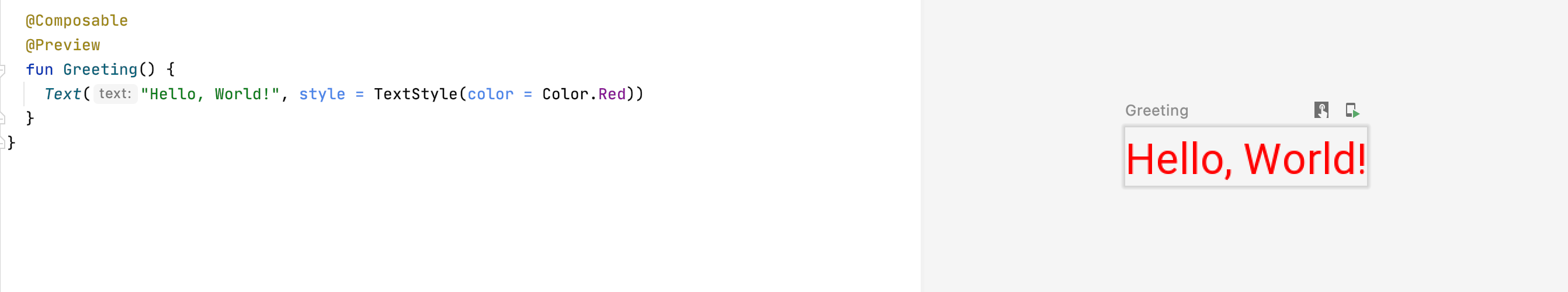
Every time you update the composable you’re previewing, you’ll have to refresh the build to see the updated view. You can only preview composables that don’t take any arguments.
Now that you can preview your components, it’s time to learn how to work with layouts.
Laying Out Composables
Having only one Text on the screen doesn’t make for a particularly interesting app. However, having three Texts on the screen should make for an absolutely riveting experience! :]
Update Greeting() to use Text() three times:
Text("Hello, World!", style = TextStyle(color = Color.Red))
Text("Hello, Second World!", style = TextStyle(color = Color.Red))
Text("Hello, Third World!", style = TextStyle(color = Color.Red))
How do you expect this composable to look? Build and run and take a look in the preview window to see if the results match your expectations.

Perfect.
Just kidding, that looks pretty awful! :]
Nothing governs the positioning of these Text controls, so they all draw on top of each other as if they were sitting in a FrameLayout. Luckily, Jetpack Compose offers a large collection of layout composables.
In this case, you’ll use the Column composable to add order to this chaos.
Using the Column Composable
Think of a Column as a LinearLayout with a vertical orientation. It simply lays out all its child composables in a vertical column.
Update Greeting() to wrap the three Text() in a Column():
@Composable
@Preview
fun Greeting() {
  Column {
    Text("Hello, World!", style = TextStyle(color = Color.Red))
    Text("Hello, Second World!", style = TextStyle(color = Color.Red))
    Text("Hello, Third World!", style = TextStyle(color = Color.Red))
  }
}
Column() takes an @Composable lambda block, which is where you declare the column’s children.
In Greeting(), you’re adding three Texts as this Columns children. This pattern of having a composable function accept a lambda to create other composable functions is common in Jetpack Compose. You might even say that it’s what the whole idea is composed of. :]
Build and run and you’ll see that you’ve now laid out the three Texts in a vertical column. Much better!

In addition to Column(), you can use Row() to lay children out in a horizontal row. This looks like a LinearLayout with a horizontal orientation.
Introducing ComposableCookBook
That was quite an introduction, and I can only imagine how excited and all over the place you are! But you might want to compose yourself because you’ll be working on an even cooler feature for the project! :]
Instead of building simple red texts, you’re going to build a cookbook app called ComposableCookBook that displays a list of delicious recipes. The project comes with a pre-defined Recipe:
data class Recipe(
  @DrawableRes val imageResource: Int,
  val title: String,
  val ingredients: List<String>
)
A Recipe has an image, a title and a list of ingredients. The app also ships with a default list of recipes in Recipes.kt. You’ll use this list of recipes to build your cookbook app.
Creating a Recipe Composable
Your goal is to use Jetpack Compose to make the ComposeCookbook recipe app look better, by creating a UI that shows each recipe in a card with the recipe’s image at the top of the card and a list of ingredients below it.
Your first step is to create a composable that shows an individual recipe.
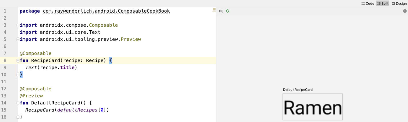
Right-click on the ComposableCookBook package and select New ▸ New Kotlin File/Class. Then select File from the list and type the name RecipeCard. Lastly, add the composable method, RecipeCard(), shown below:
@Composable
fun RecipeCard(recipe: Recipe) {
  Text(recipe.title)
}
For now, this just displays the title of the recipe using Text().
Since RecipeCard() takes a parameter, you can’t use @Preview. However, you can create another composable method that supplies a default RecipeCard(). Add the following below RecipeCard():
@Composable
@Preview
fun DefaultRecipeCard() {
  RecipeCard(defaultRecipes[0])
}
You can now preview the RecipeCard().
Next, you’re going to add an image to RecipeCard(), above the title.
Adding an Image to the RecipeCard
Replace the contents of RecipeCard() with the following:
// 1
val image = imageResource(recipe.imageResource)
// 2
Column(modifier = Modifier.fillMaxWidth()) {
  // 3
  Image(asset = image, contentScale = ContentScale.Crop, modifier = Modifier.fillMaxWidth().height(144.dp))
  Text(recipe.title)
}
Make sure to import all the functions which might be marked as red, as unresolved references. There’s a lot of magic going on there for such a tiny chunk of code! Then refresh the preview if needed.
Here’s a breakdown:
- Each
Recipecomes with an image resource which points to aDrawable. Normally, you’d either set the drawable on anImageViewor use aContextto get an instance of aDrawable.In Jetpack Compose, you use a different mechanism to get an instance of the
Image. This line tells Jetpack Compose to fetch anImagefrom a given drawable resource identifier. - Next, you’re using the
Column@Composableyou learned about earlier to lay out your recipe card contents in a vertical layout. Ideally the images associated with the recipe should be full width, so you’re using aModifierto tell thisColumnto expand to be full width.Modifiers let you adjust the UI of a composable. In this scenario, you’re using a modifier to control the sizing of the
ColumnYou can use modifiers for much more than sizing, including expanding a composable or applying an aspect ratio.
- Finally, you’re using
Image()to render the image, passing through the image you retrieved in the first step. Just like with theImageViewclass that you know and love, you can set the content scale, width and height of anImage. To do so, you’re using aModifierto set the width and the height of the image, and thecontentScaleargumnet to set the content scale.
Refresh the preview and you’ll see your recipe card starting to take shape!

That ramen looks pretty tasty – but what ingredients do you need to cook it? For your next task, you’ll create an ingredient list.
Listing Ingredients
To list the ingredients, you’ll use your handy Text(). Since you already defined a Column() in the previous step, adding the ingredients will be easy.
Add the following below the Text drawing the recipe’s title:
for (ingredient in recipe.ingredients) {
  Text(ingredient)
}
One of the awesome things about Jetpack Compose is that you can use normal Kotlin code to express slightly more complex UI details.
In the above code, you use a for loop to list all the Text ingredients. If you rebuild the UI you’ll see all the ingredients of this delicious ramen meal listed below the title. Pretty cool, right? And you didn’t have to define a RecyclerView.Adapter, or any ViewHolders!

That ramen does look tasty, but the recipe card itself looks pretty square. Next, you’ll add rounded corners to the recipe card, to make it nicer.
Rounding the RecipeCard’s Corners
Using a Surface() parent gives you the option to round the corners of your item. Replace the existing contents of RecipeCard() with the following:
Surface(shape = RoundedCornerShape(8.dp), elevation = 8.dp) {
  val image = imageResource(recipe.imageResource)
  Column(modifier = Modifier.fillMaxWidth()) {
    Image(asset = image, contentScale = ContentScale.Crop, modifier = Modifier.fillMaxWidth().height(144.dp))
    Text(recipe.title)
    for (ingredient in recipe.ingredients) {
      Text("• $ingredient")
    }
  }
}
Surface() handles drawing shapes and providing a component’s elevation. For the recipe card, you’ll use a Surface() with a RoundedCornerShape() and an elevation of 8 dp.
Refresh the build. The preview should now show a rounded card!

The card is starting to shape up, but it’s missing two things: some basic styling on the title component and some padding between elements. You’ll take care of that in the next step.
Improving the Recipe Card’s Look
Start by adding a text style inside the recipe title Text():
Text(recipe.title, style = MaterialTheme.typography.h4)
Here, you use the style parameter to style your text with the default MaterialTheme typography header style.

Adding Padding to the Recipe Card
To add the padding to your card, wrap the title and ingredient Text() inside another Column() and add the following modifier:
Column(modifier = Modifier.padding(16.dp)) {
  Text(recipe.title, style = MaterialTheme.typography.h4)
  for (ingredient in recipe.ingredients) {
    Text("• $ingredient")
  }
}
In addition to using modifiers to control width and height, you can also use them to add padding to different @Composables.
Rebuild the preview. You should see a beautiful recipe card:
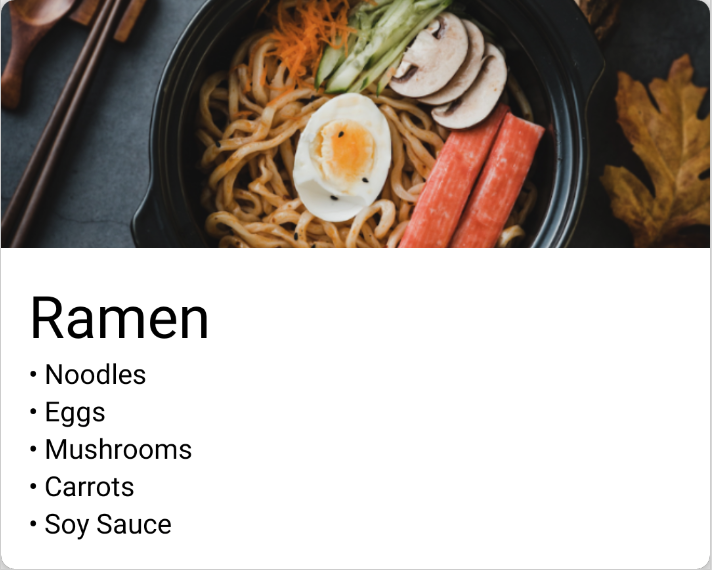
Your recipe card looks great now. It’s time to give your users the ability to make lists of their favorite recipes.
Creating a List of Recipes
Normally, to make a list you’d use something like a RecyclerView. In Jetpack Compose, you can use the LazyColumnFor @Composable to achieve a scrolling list of lazily instantiated items just like you would with a RecyclerView, but in only a fraction of the code!.
To start putting together your list of recipes, right-click on the root code package once more, and select New ▸ New Kotlin File/Class. Then select File from the list and type the name RecipeList. Finally, add RecipeList() to the file:
@Composable
fun RecipeList(recipes: List<Recipe>) {
  LazyColumnFor(items = recipes) { item ->
    RecipeCard(item)
  }
}
Make sure to import the missing references. The LazyColumnFor @Composable accepts a list of items and an @Composable lambda that takes one argument – a single item within your list. You can then use that item to build up your scrolling list. No ViewHolders or Adapters to be found here!
Now that you have a composable to show your list of recipes, it’s time to wire everything up in your MainActivity and see your hard work on a device!
Wiring Everything Up
Navigate to MainActivity and replace the contents of setContent() with the following:
RecipeList(defaultRecipes)
Build and run. You’ll see a mouth-watering list of delicious foods.

The app is looking good, but you can’t really differentiate the individual recipe cards. To clean this UI up, you’ll need to add some padding between items.
Open the RecipeCard file again and update the RecipeCard function to pass a Modifier in to your Surface:
fun RecipeCard(recipe: Recipe, modifier: Modifier) {
  Surface(shape = RoundedCornerShape(8.dp), elevation = 8.dp, modifier = modifier) {
  ...
  }
}
Then update the DefaultRecipeCard preview method to pass in a modifier:
@Composable
@Preview
fun DefaultRecipeCard() {
  RecipeCard(defaultRecipes[0], Modifier.padding(16.dp))
}
Next up, open the RecipeList file and add a 16dp padding modifier to your RecipeCards. The RecipeList method should now look like this:
@Composable
fun RecipeList(recipes: List<Recipe>) {
  LazyColumnFor(items = recipes) { item ->
    RecipeCard(item, Modifier.padding(16.dp))
  }
}
Run the app again. You should see a well spaced list of delicious foodstuffs.

The only thing the app is now missing is a toolbar! You’ll add one as your final step.
Adding a Toolbar
Having a Toolbar is the default behavior of Android applications, so it’s important to include it! Replace the contents of setContent() in the MainActivity file with the following:
// 1
Column(modifier = Modifier.fillMaxSize()) {
  // 2
  TopAppBar(title = {
    Text("ComposableCookBook")
  })
  // 3
  RecipeList(defaultRecipes)
}
Here’s a breakdown of the code:
- Just like before you’re using a
Column, but this time you’re telling it to fill all available spacing by specifying aModifierwithfillMaxSize(). - You’re then using the
TopAppBar@Composableto add a toolbar. Note that instead of just passing aStringto the toolbar, you instead pass another@Composable. This gives you a huge amount of control over how to display content in your toolbar! For this app, a simpleTextwill suffice for the content of your toolbar. - Finally, you’re adding your
RecipeListto the column to sit below theTopAppBar
Build and run and you’ll see a fancy new toolbar at the top of ComposeableCookBook.

Congratulations! You’ve built your first app using Jetpack Compose.
Comments
Post a Comment